Customizing Component Menu
We saw how Singlepage creates Edit Settings option in the component menu and a form for editing component properties by parsing props
attribute of your Vue.js component. For most components, this might be sufficient. There are situations, however,
where you may want to customize the Edit Settings form and add commands to the component's drop-down menu.
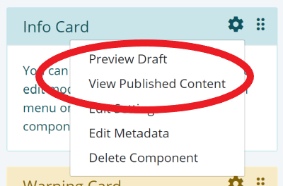
Singlepage provides a mechanism for doing just that. One of
the built-in components Html.vue uses this feature to create a custom property editor and commands that allow
the user to switch between published content and draft content.
You can create the custom entries for a component by
defining an actions attribute in the data section. The data specification for Html.vue is shown below.
      data: function() {
        return {
          mode: 0,
          actions: {
            settings:
              {
                fields: [
                  { name: 'content', required: true, label: 'msg_published_content', rows: 6, type: 'textarea'},
                  { name: 'draft', label: 'msg_draft_content',  rows: 6, type: 'textarea'}
                ]
              },
            commands: [
              {
                name: "view-draft",
                label: "msg_view_draft",
                action: this.viewDraft.bind(this)
              },
              {
                name: "view-published",
                label: "msg_view_published",
                action: this.viewPublished.bind(this)
              }
            ]
          }
        };
      }
As shown in the listing, the actions object has two attributes: settings and commands. settings defines
a JSON form that is processed by Singlepage built-in component Form. The commands array adds two options to the
component dropdown menu and specifies corresponding methods to be executed when the user clicks on those options. The
Html.vue command method implementation is shown below.
      methods: {
        viewPublished: function() {
          this.mode = 0;
        },
        viewDraft: function() {
          this.mode = 1;
        }
    }
In this case, the command method change the mode flag which is used by the view template to decide whether to display
published content or the draft.